Creator’s Notebook: An Early Version of Epochalypse
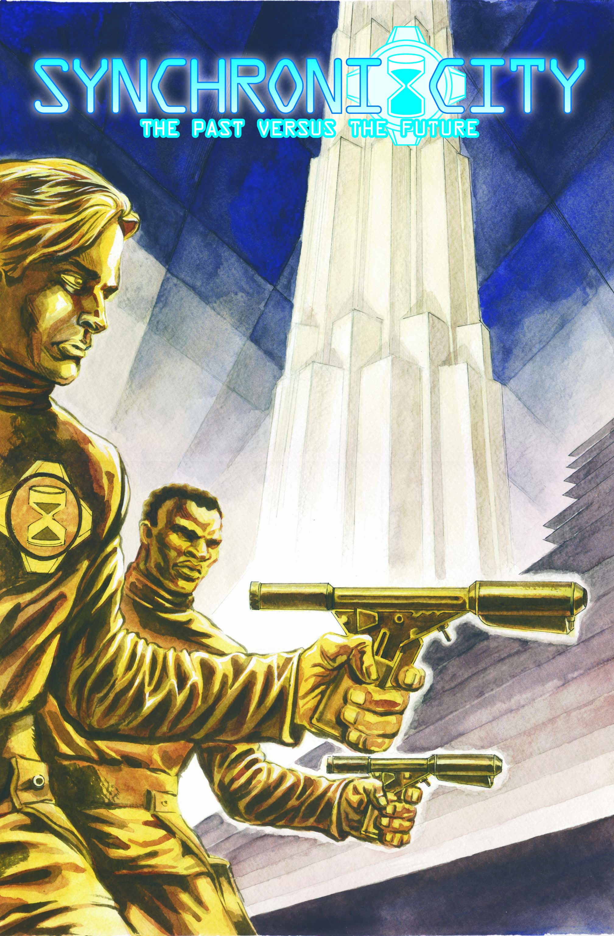
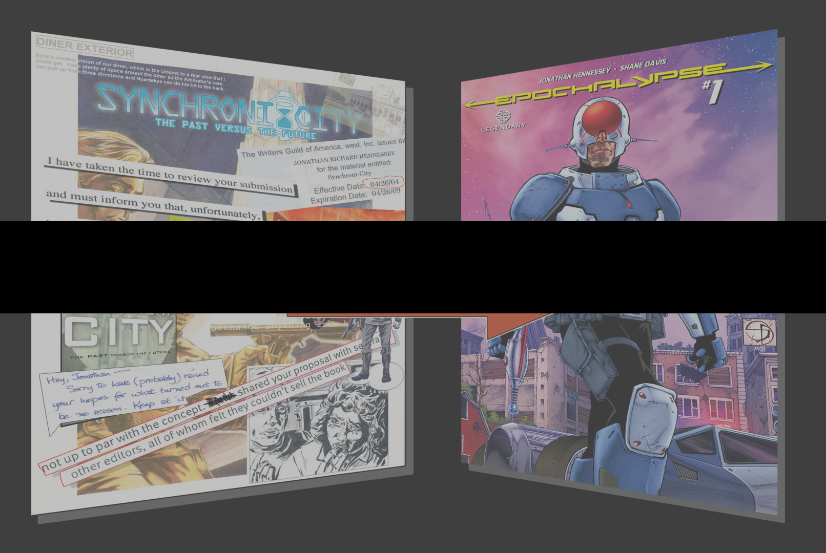 To help herald the December 24, 2014, release of Epochalypse #2, I would like to share with you — in its entirety — the artwork from an early version of the project back when it had the somewhat less elegant title, Synchroni-City.
Quandary: you’re a would-be comics creator. And you think you’ve got a terrific idea for a series. But you can’t draw. Not worth a damn. So what do you do?
In my case, the answer was simple: stalk artists.
See, I had a probably well-founded premonition. I knew that as a writer (especially back in 2004) I was a complete unknown. And I reckoned I wasn’t going to get very far trying to push a mere words-only treatment, proposal, or elevator pitch for Epochalypse into the hands (or ears) of comics editors. You may find yourself in heady possession of an absolutely gangbusters story concept or character, and sit down and compose a really tight and grabby outline for it. But even with such a document in hand, your options are severely limited. Reading requires time, energy, and attention span that the gatekeepers of the creative world just don’t often have. I know: I scratched out a living for years reading spec screenplays, novels, stage plays, graphic novels, and TV scripts for several Hollywood production companies. Even writers with enormous talent and bottled-lightning ideas can mail outlines off, fax them in, hand them off to assistants or an agents. But still. There are, all too often, just too many impediments to sitting down and reading anything.
Yet there is a genius to the visual image. Flip a bunch of pages of handsome, finished comics art in front of someone’s eyes, and if those pages have attained some minimal level of accomplishment and sophistication, something registers in the person you’re trying to pitch to: Okay. This might be for real. And it’s never as burdensome a commitment to read five or so comics pages as it is to even absorb several paragraphs of written material.
So that’s what I determined to do: find an artist and commission a spec issue of this project.
This turned out to be much easier said than done.
I shuffled quizzically through many an Artist’s Alley. Spent hours trolling Deviant Art and Penciljack and the like. I lurked in lines of Portfolio Reviews, trying to catch a glimpse over struggling illustrators’ shoulders to gauge what they had going on before I tried chatting them up. I even posted on Craigslist.
Nothing ever worked out.
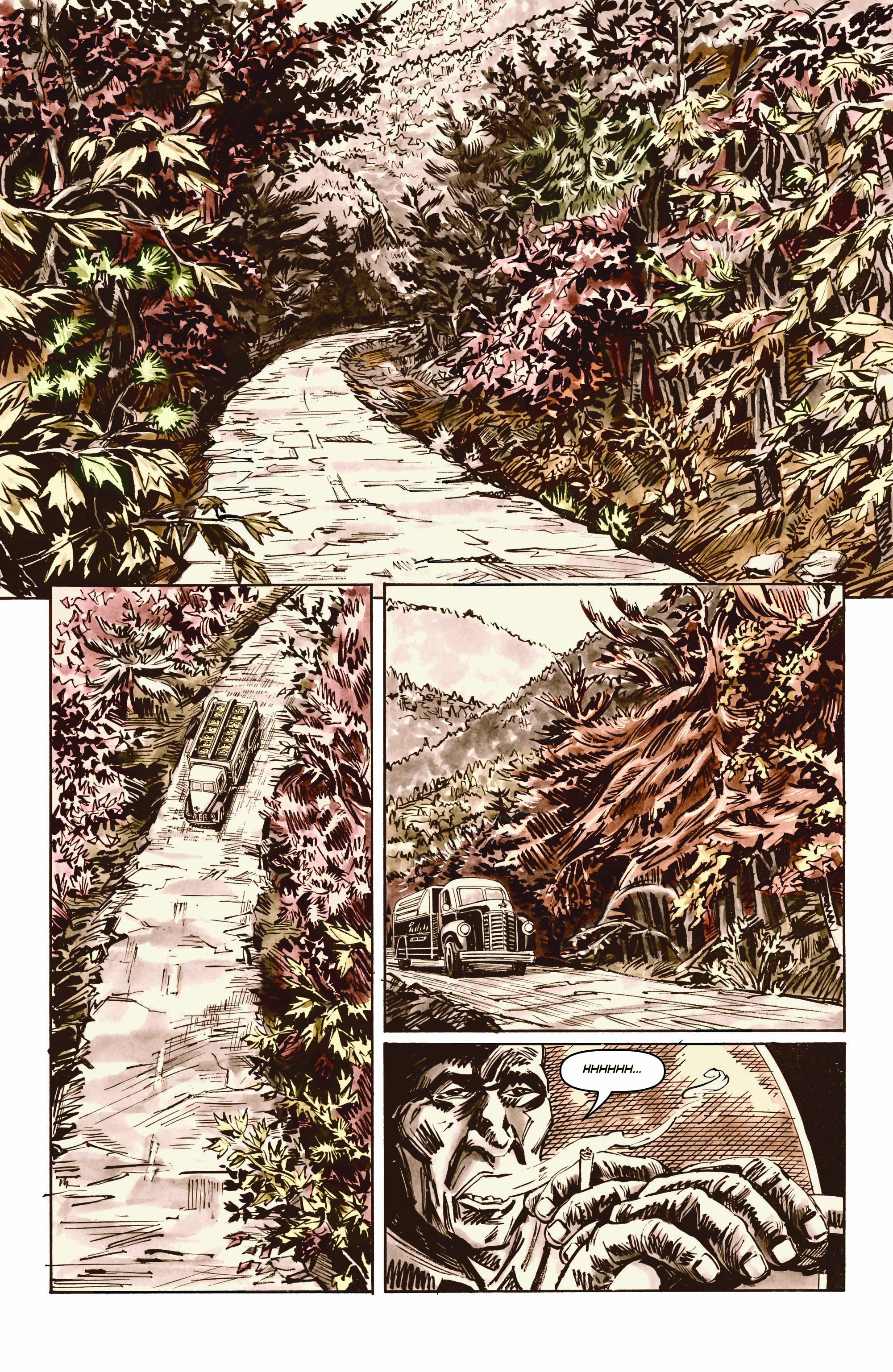
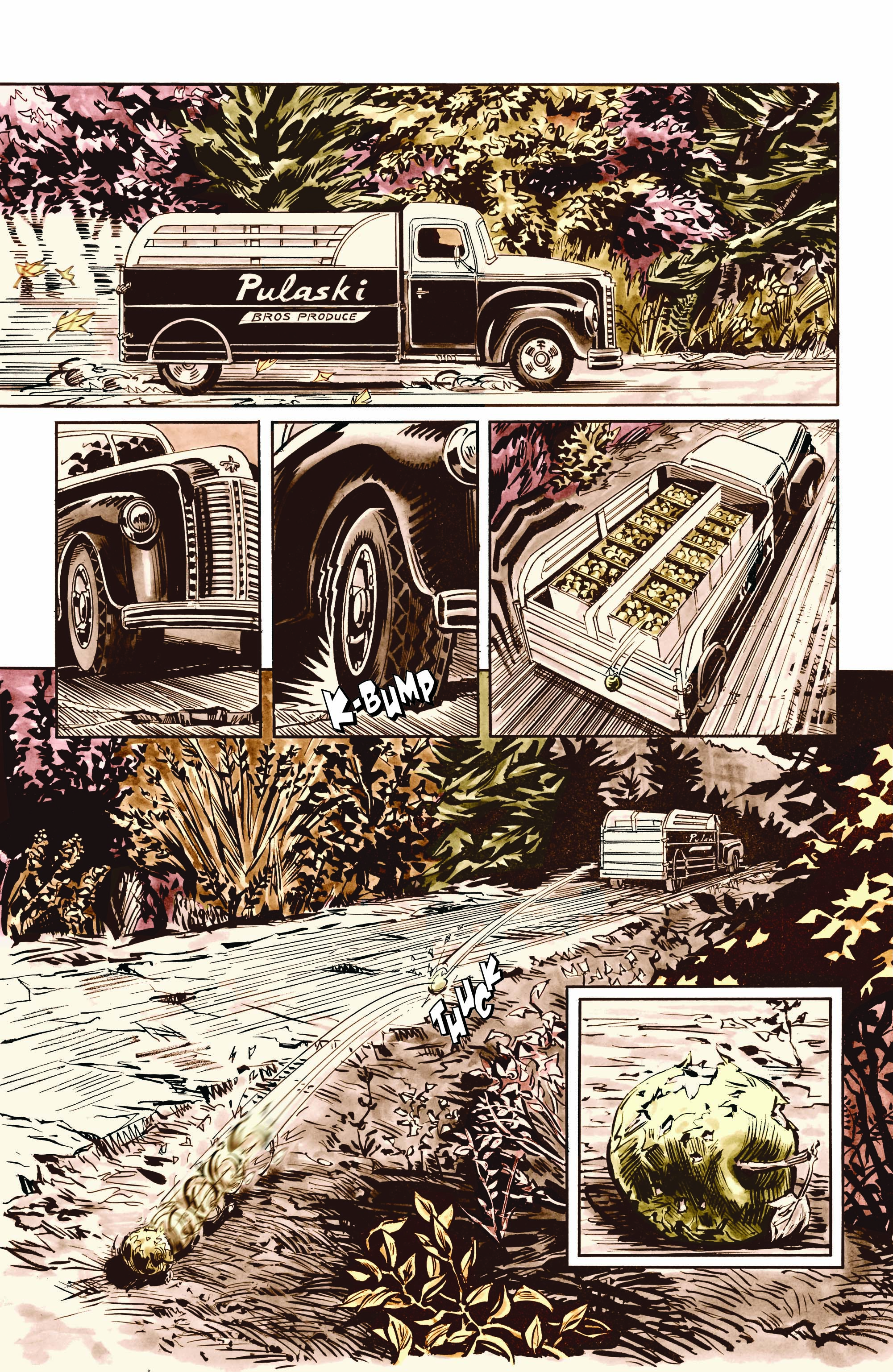
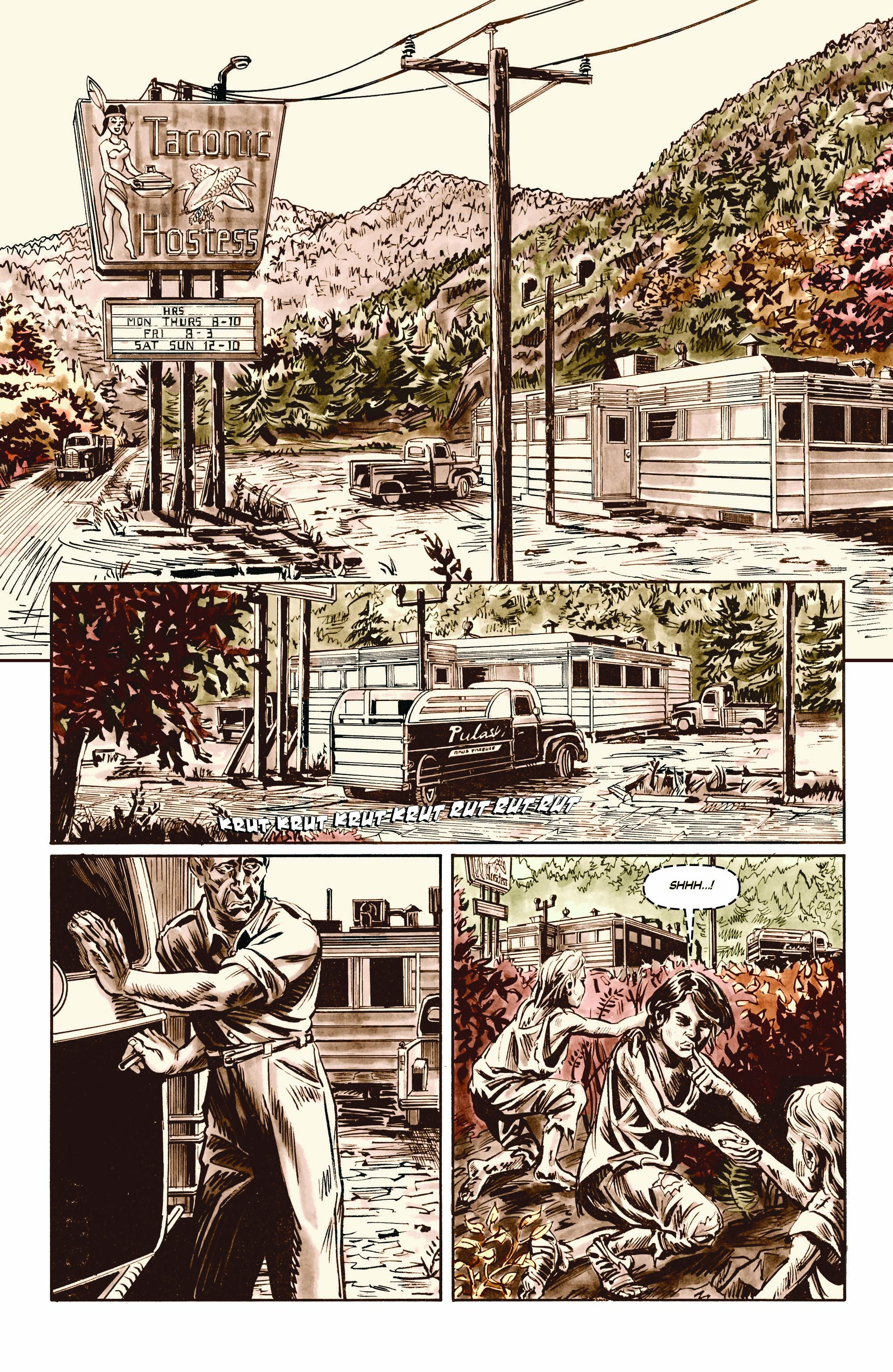
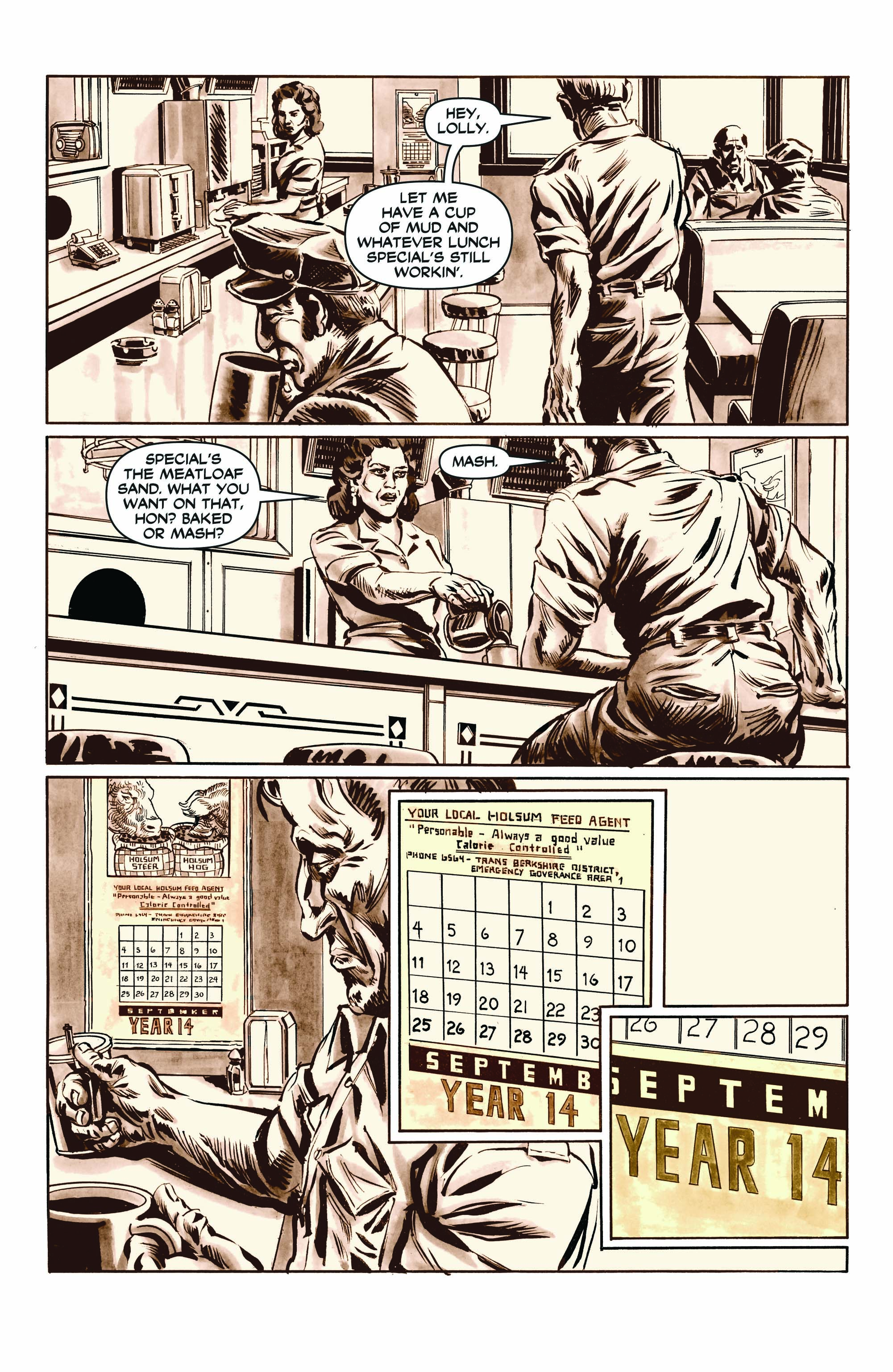
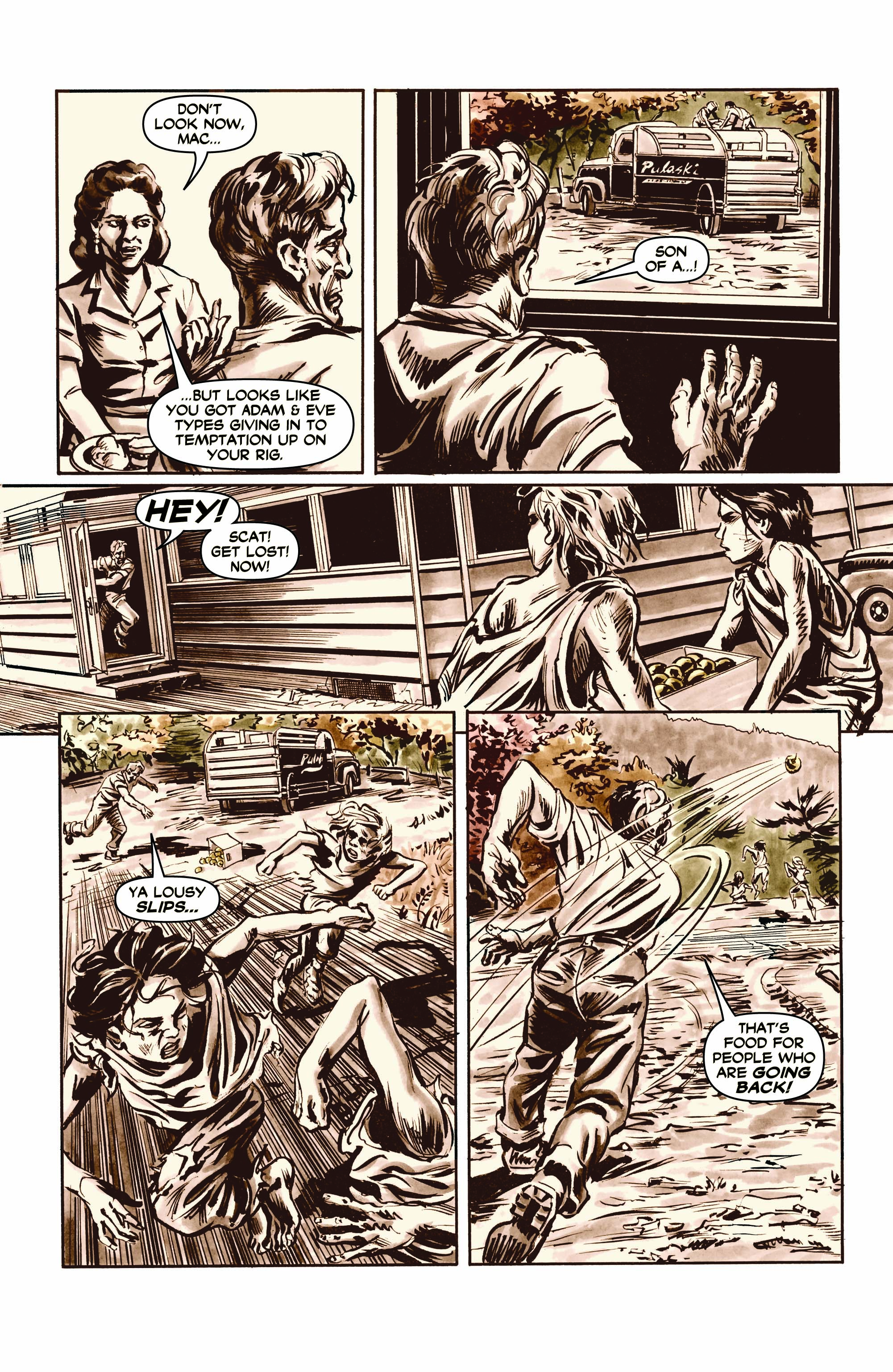
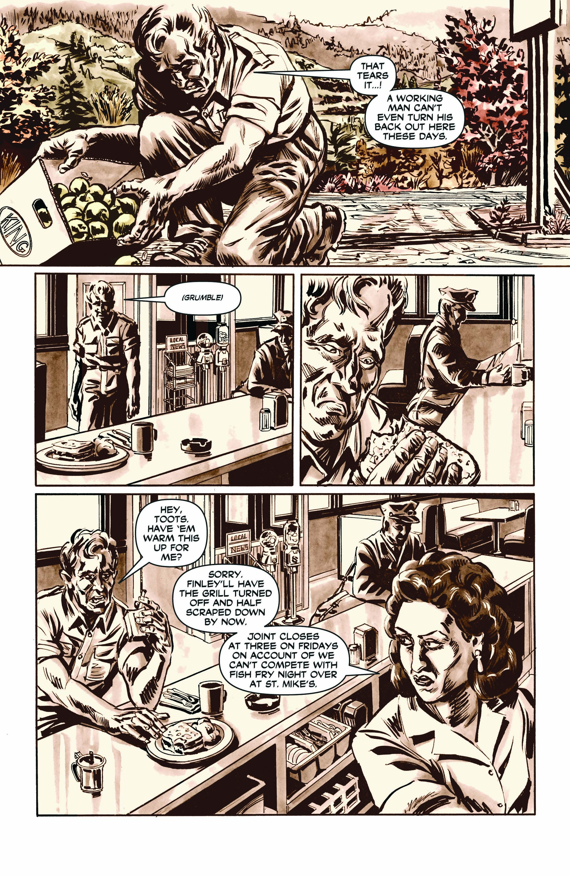
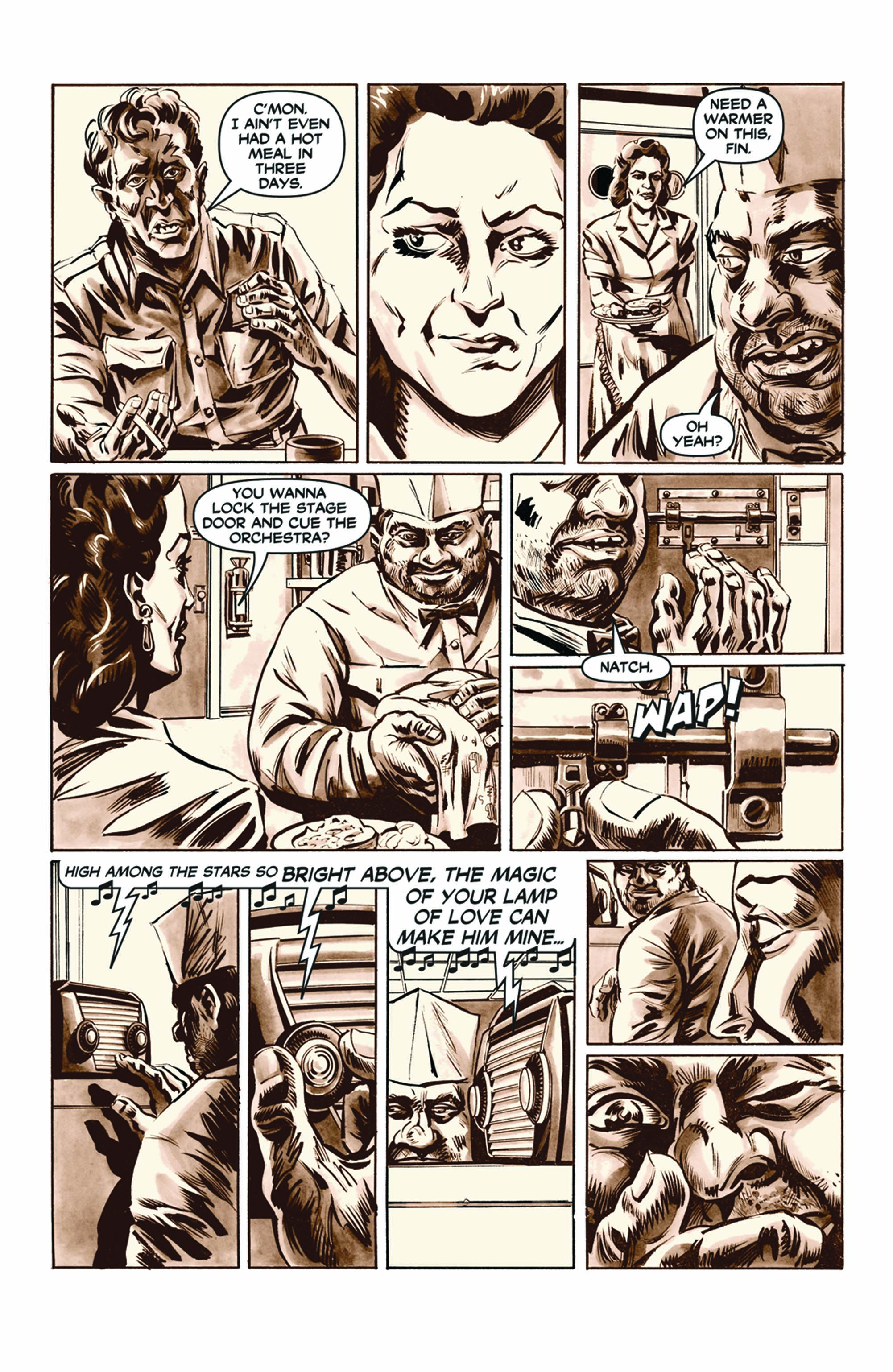
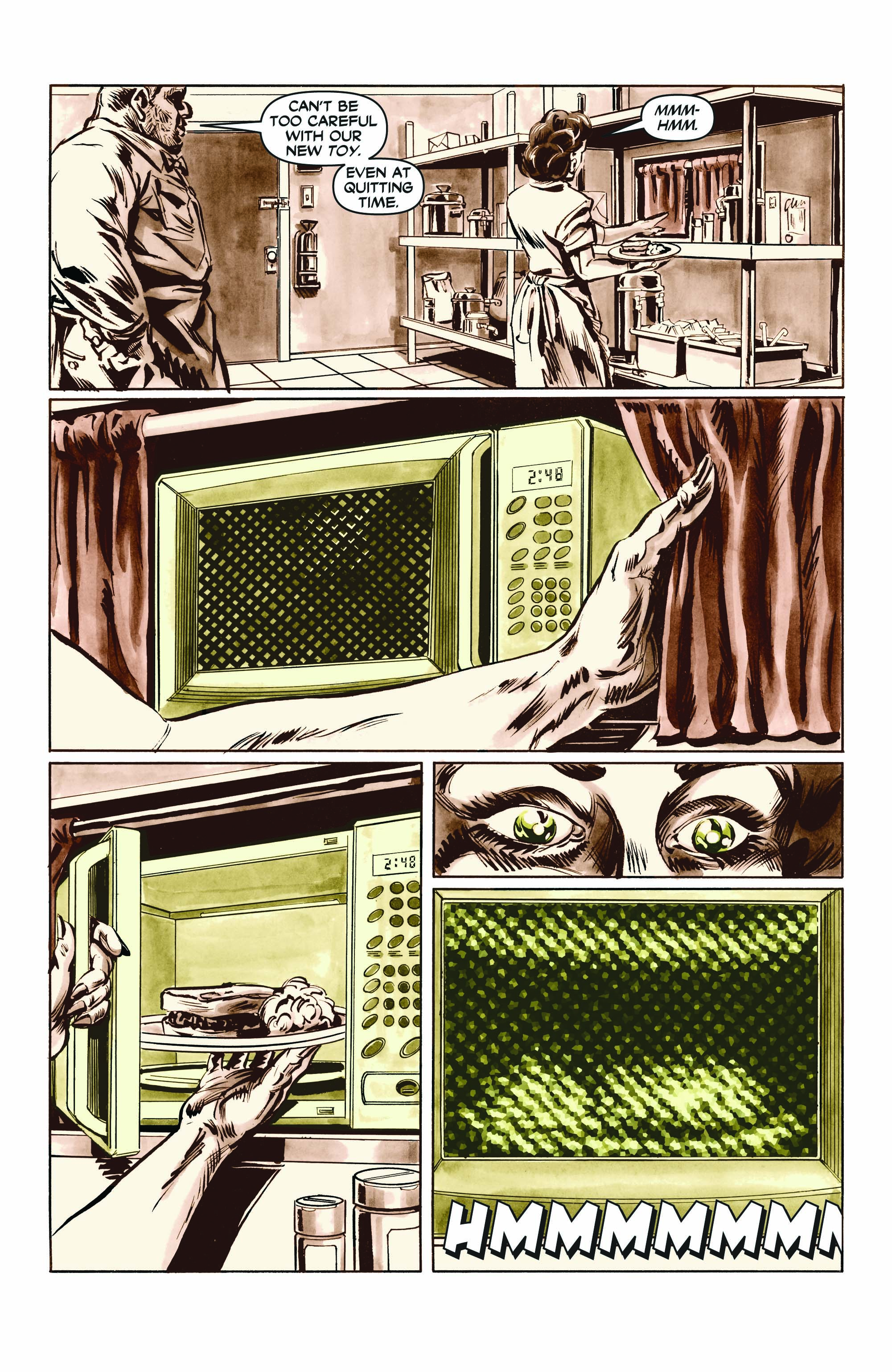
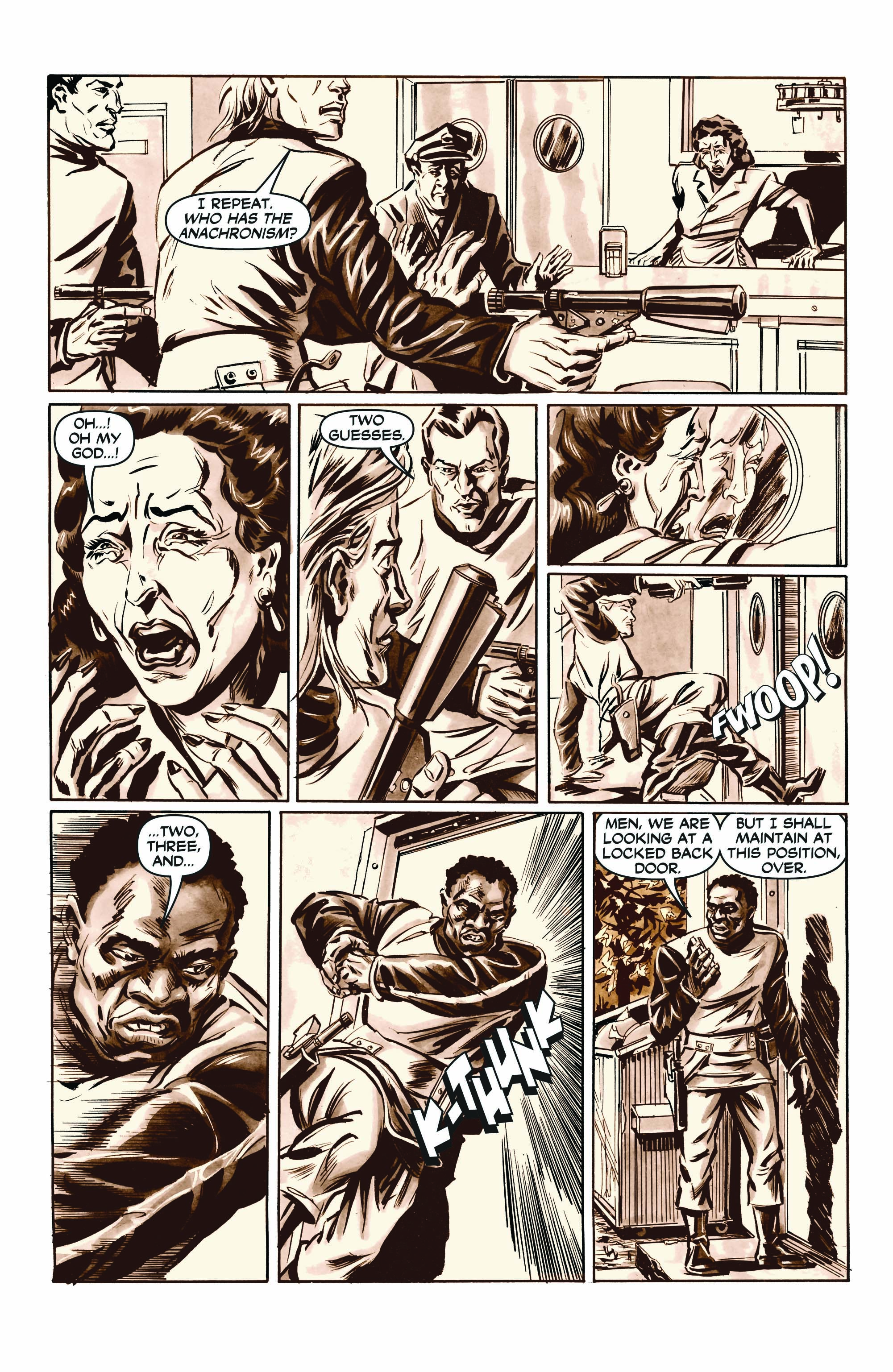
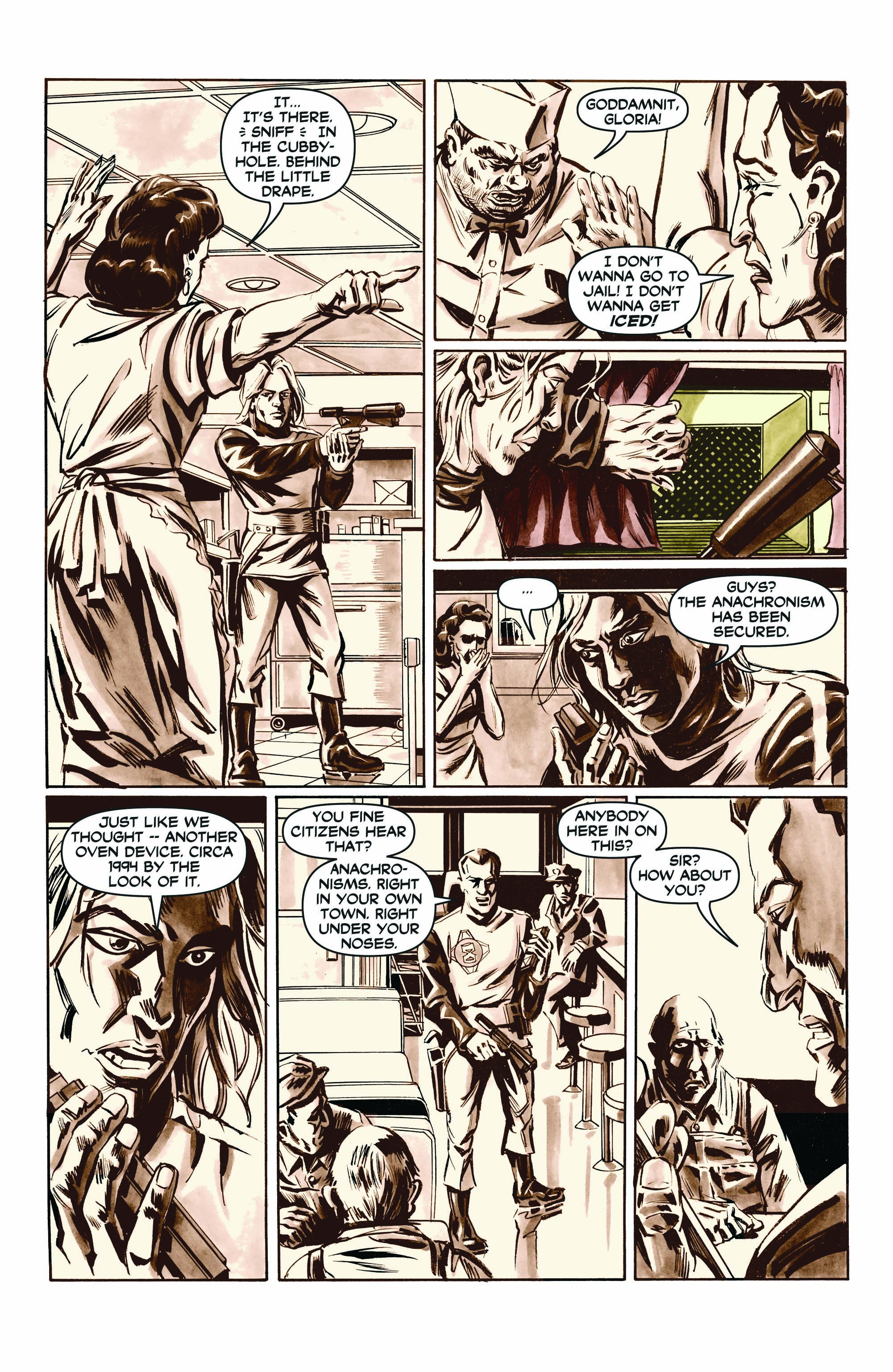
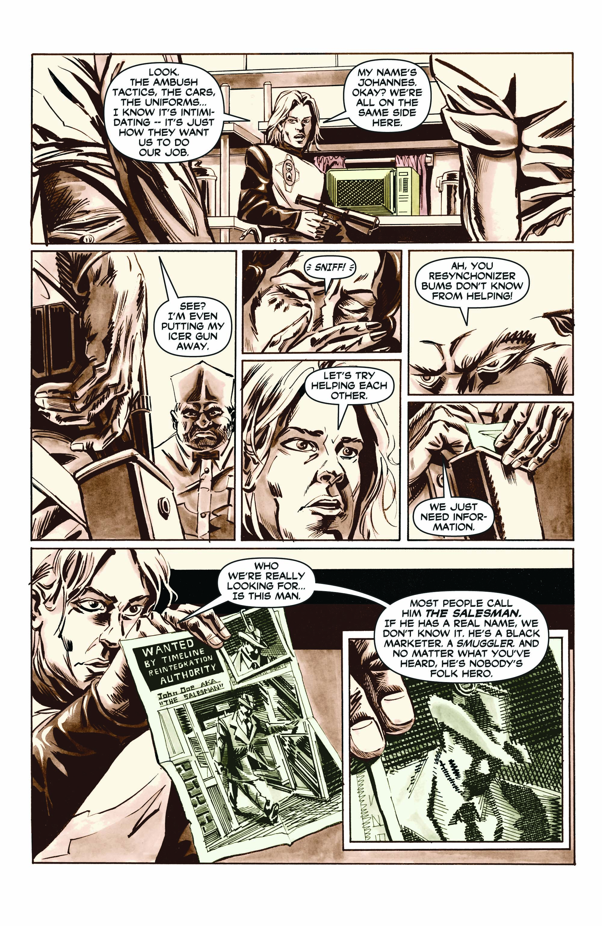
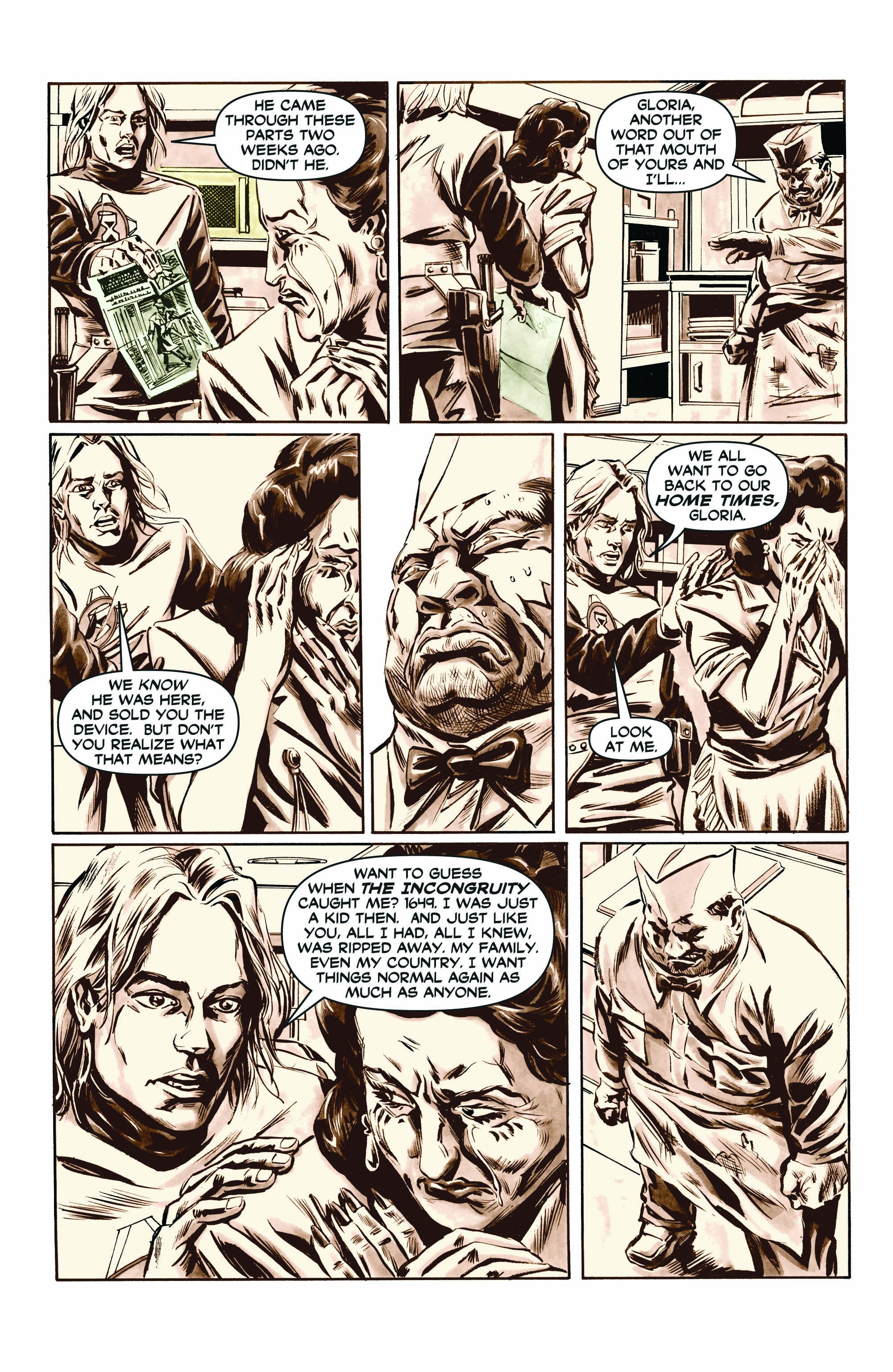
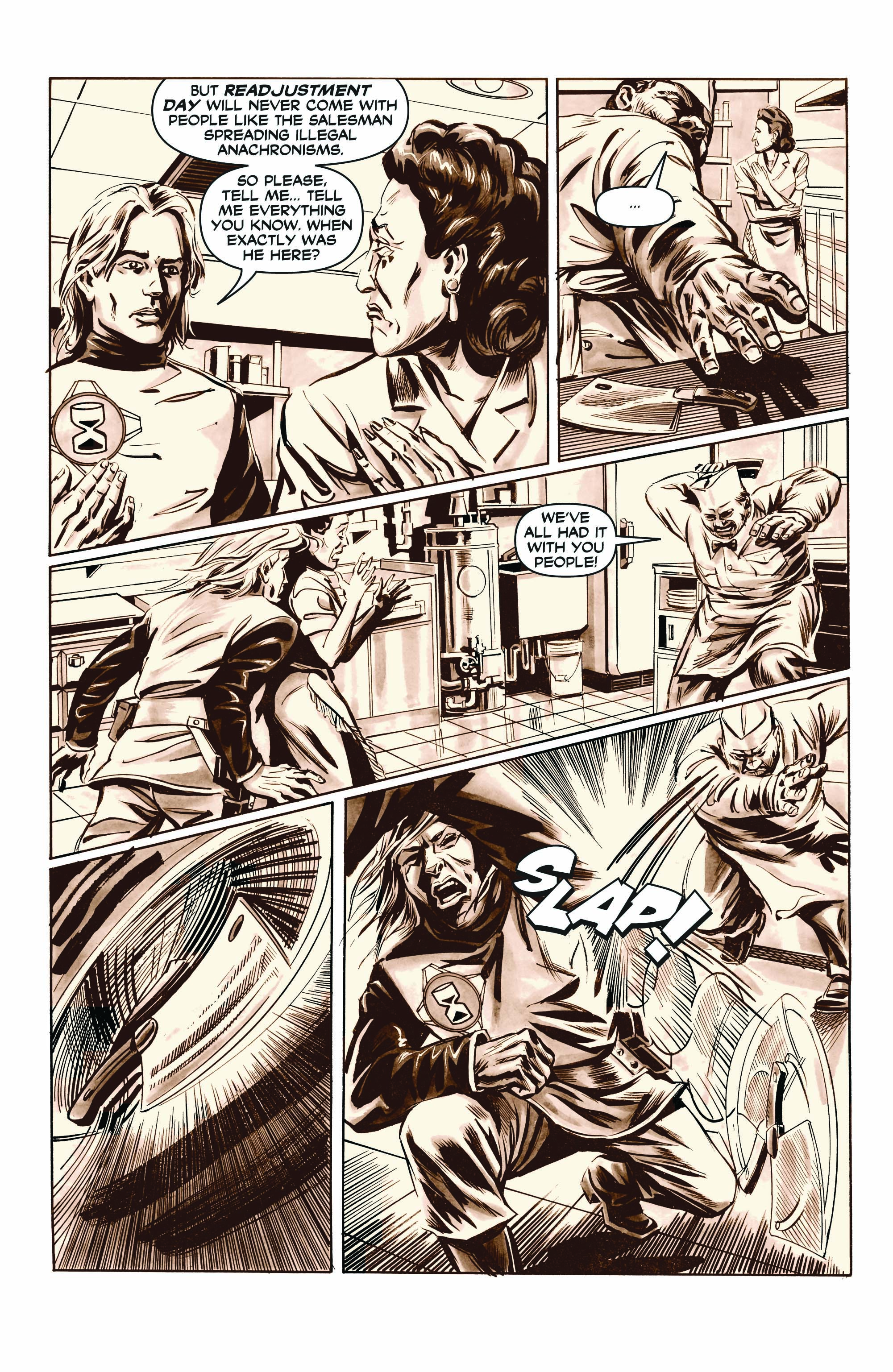
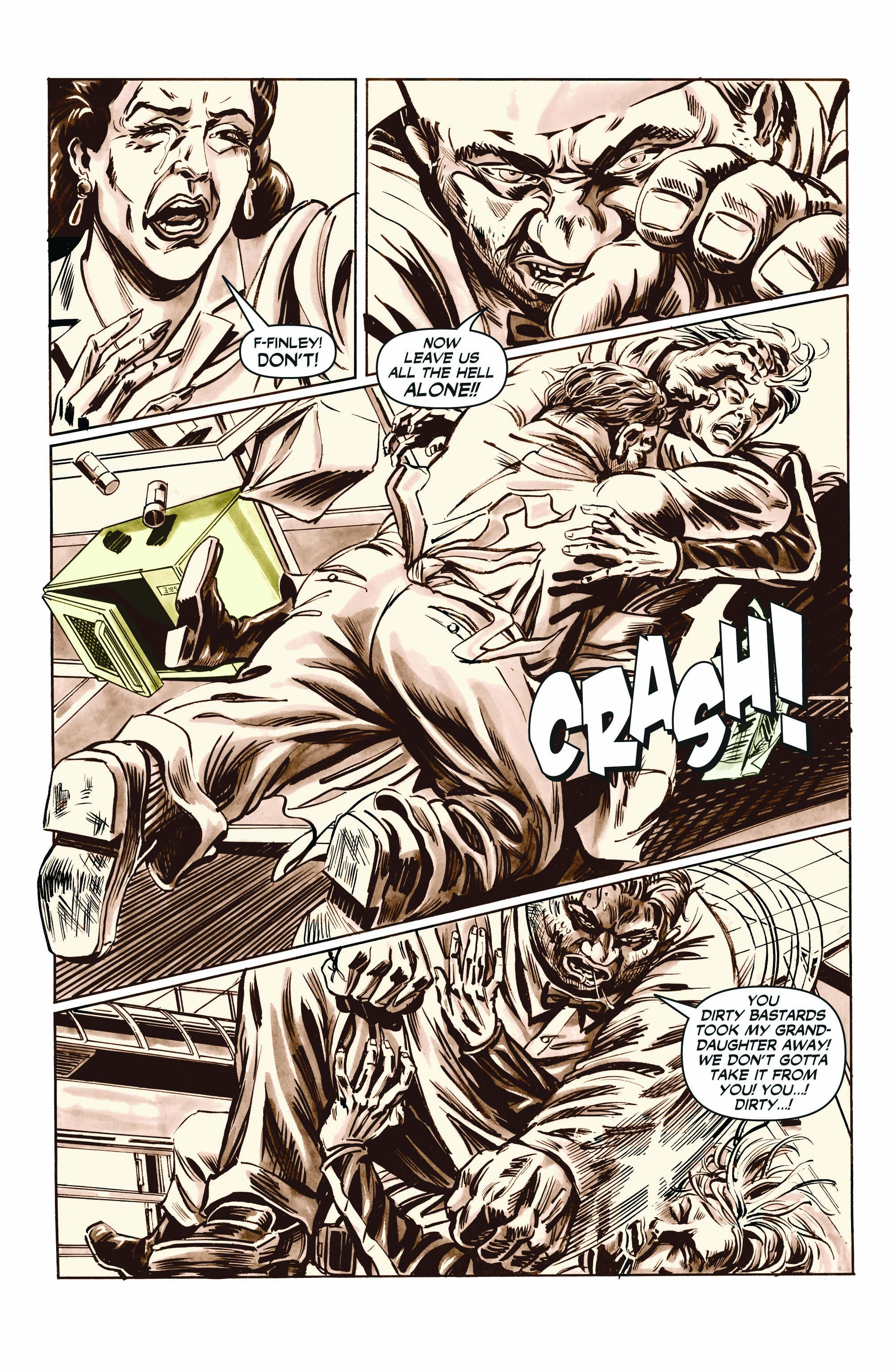
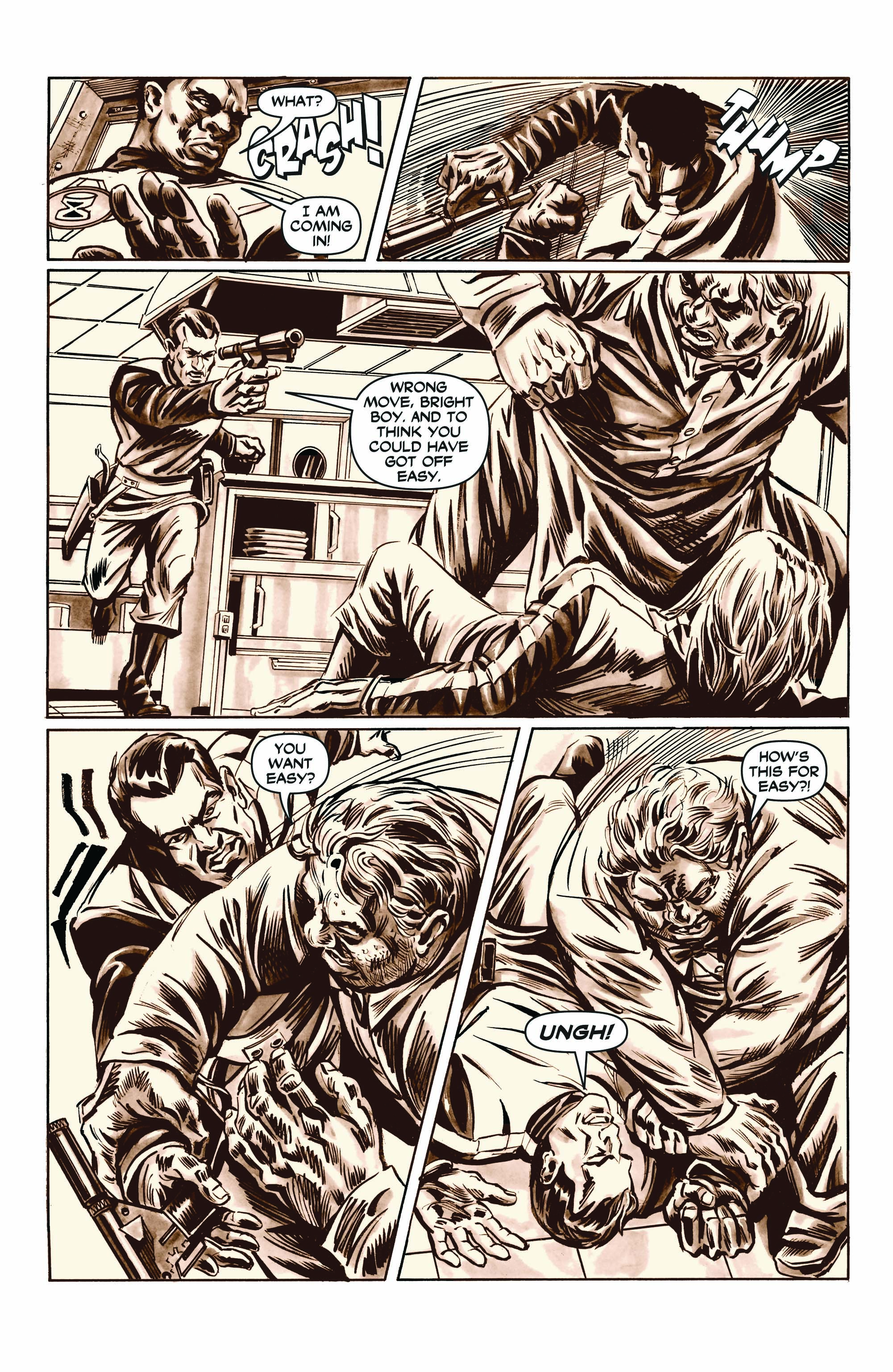
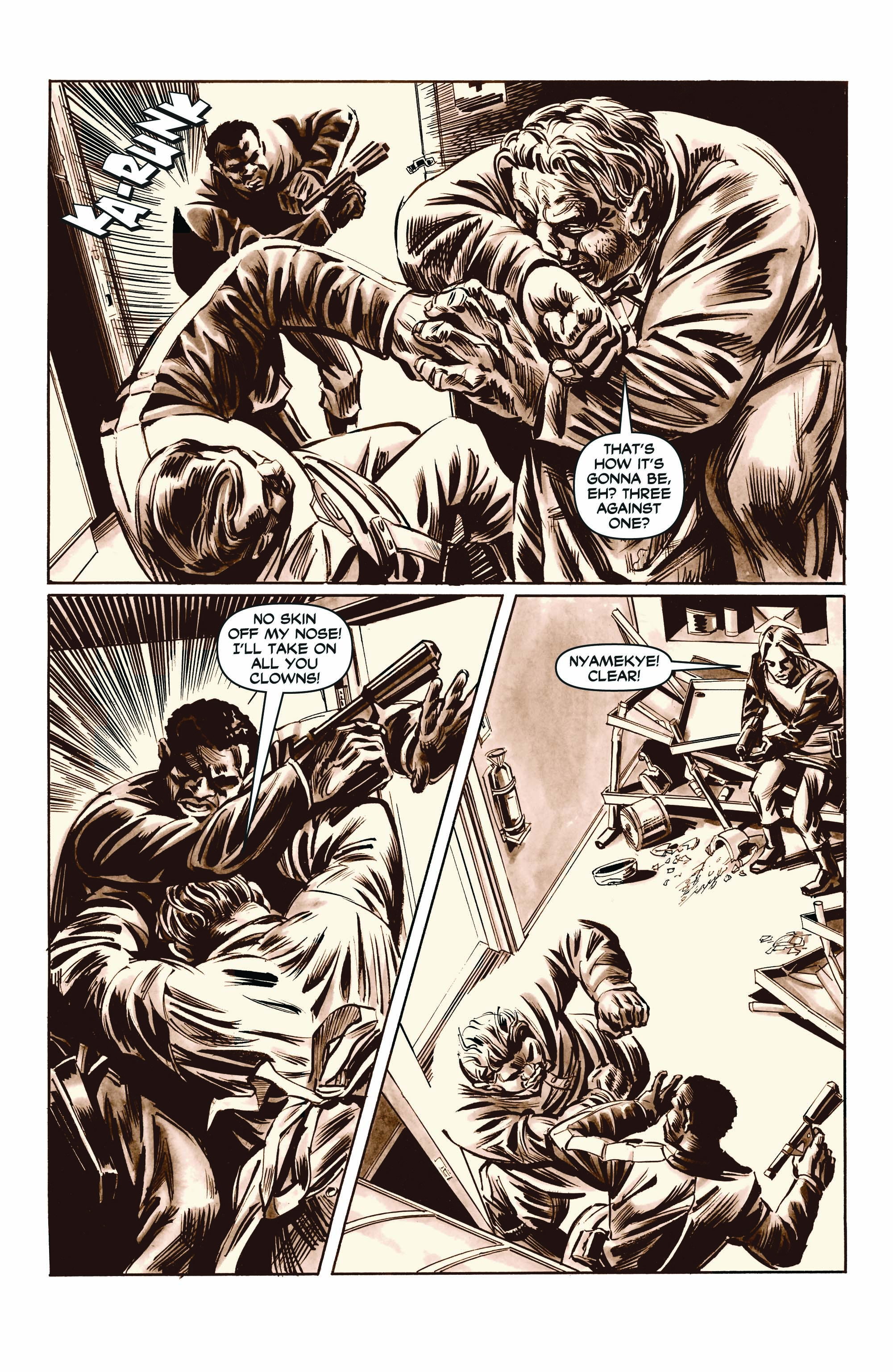
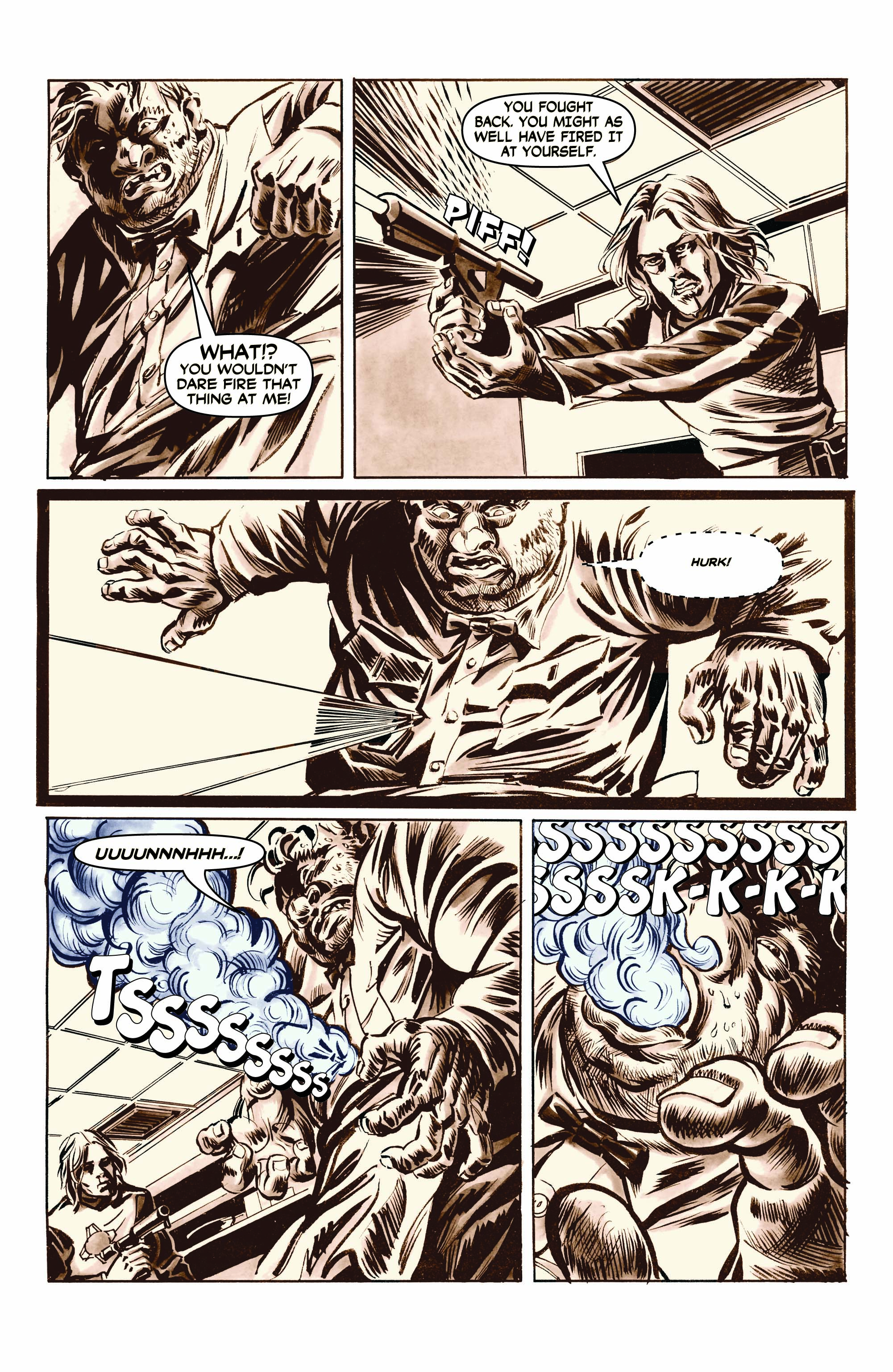
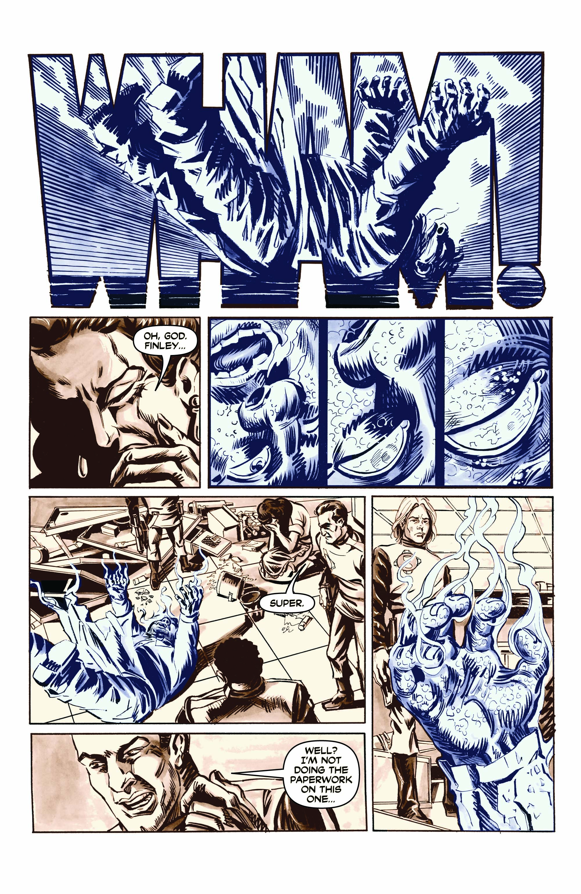
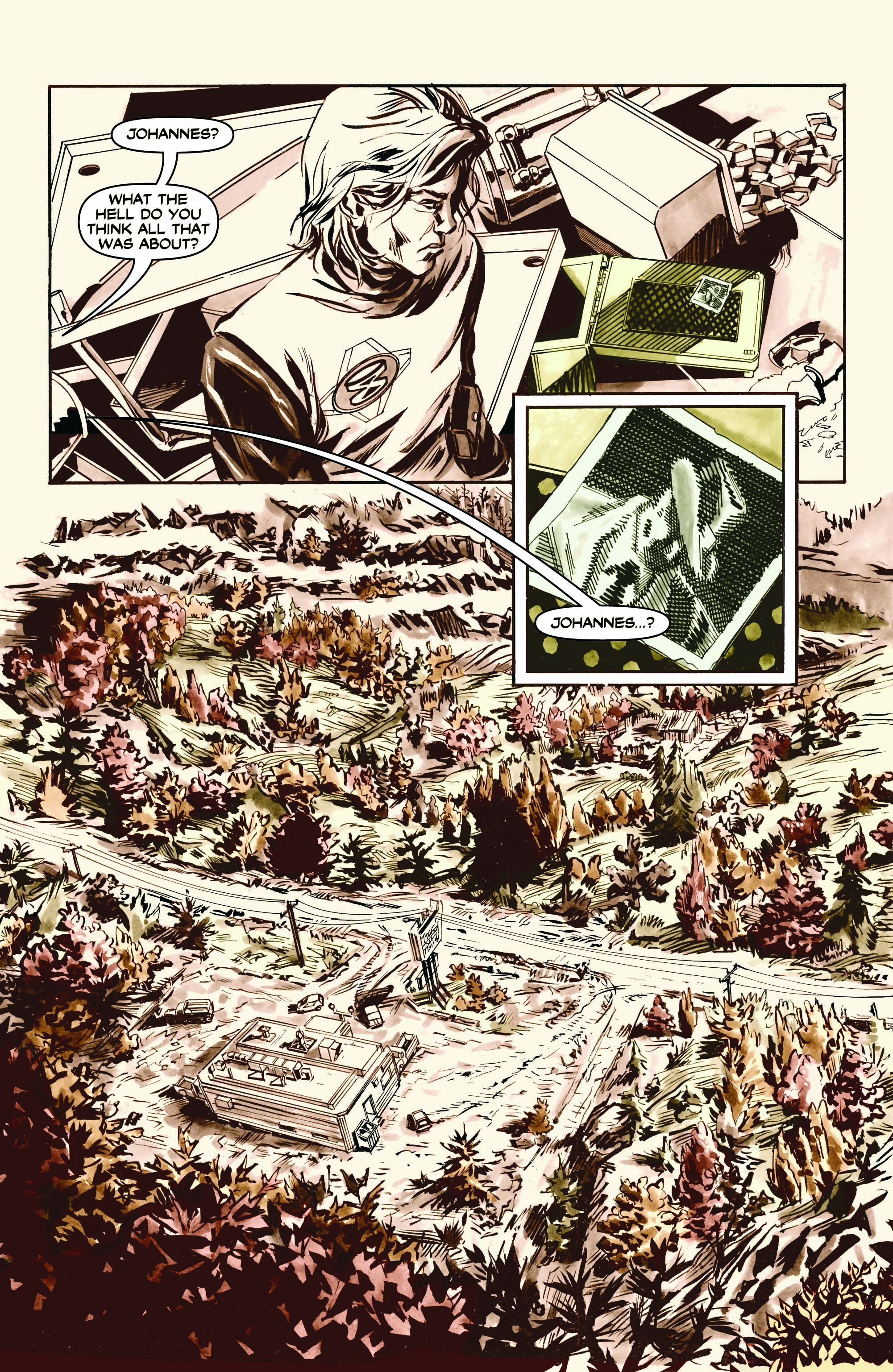
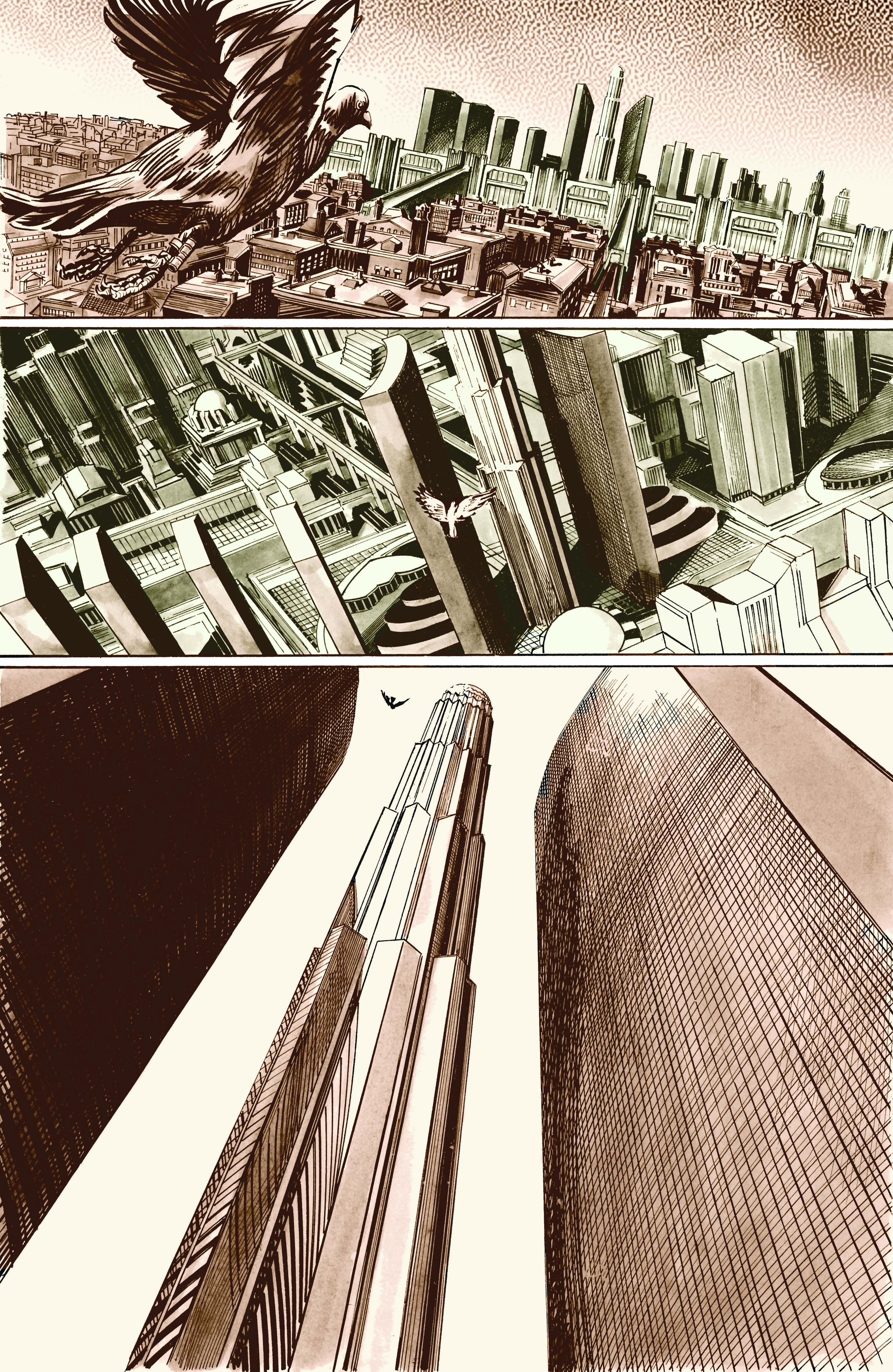
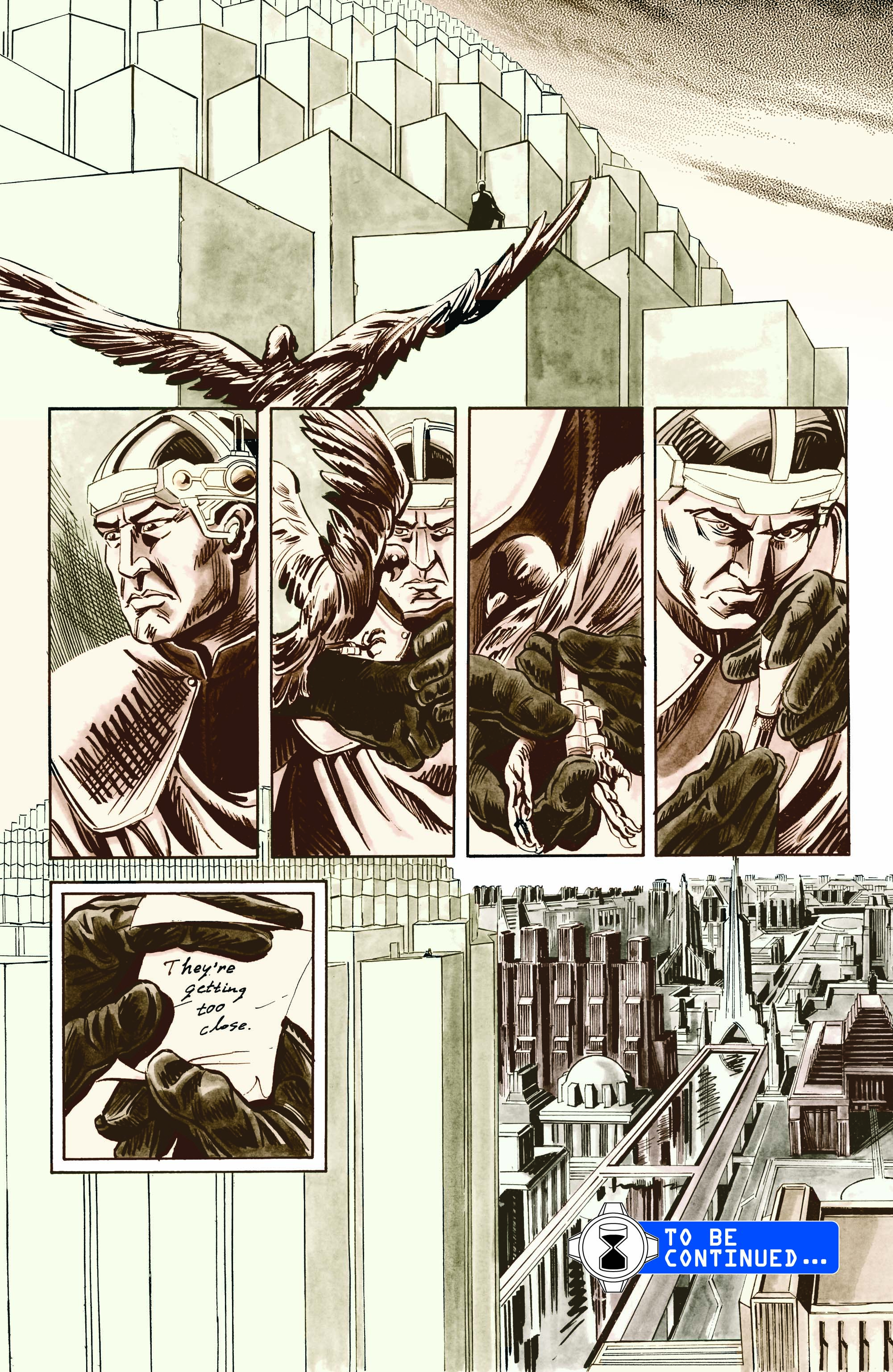
But finally I met up with Aaron McConnell, whom I linked with thanks to the truly awesome Rhode Island School of Design. (I grew up in neighboring Massachusetts, and some of the most talented and interesting people I ever met went there). Aaron “got it” and went to work. Yes, I was paying the man, but I didn’t quite have the budget for a colorist too. So we agreed to experiment with a limited color palette. Besides just being more efficient, I thought this choice would give me the additional storytelling virtue of being able to “call out” key images like the anachronistic microwave oven and the cook character’s being iced.
This spec issue was completed in 2006. In hindsight, I’m not sure all the (ahem) “artistic direction” I gave as a writer reflected the best choices. After trying to get it out there, it struck me that editors couldn’t quite see past the design gimmick of the limited color palette. They couldn’t imagine the story if the art was to take a different, more conventional, direction.
But not only did this early swipe at Epochalypse open a few doors the way I had hoped it might, but also it paved the way for Aaron and I to collaborate on three original nonfiction graphic novels — and hopefully (if I’m lucky!) many more future projects to come.
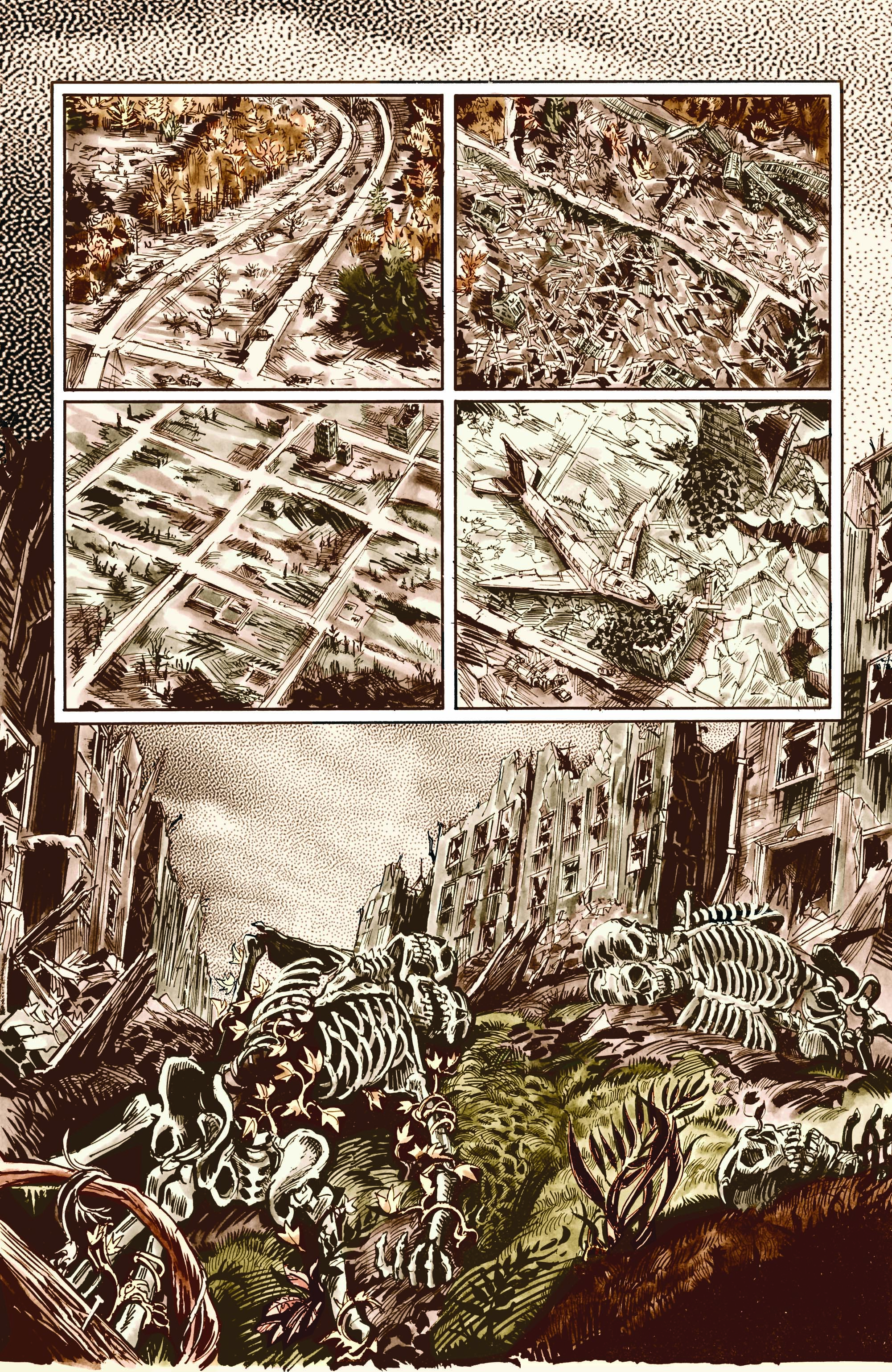
So take a gander at the version of Epochalypse #1 that just never quite had enough fuel to reach orbit. Personally, I find it kind of amazing to see the overlap between what Aaron and Shane Davis (who intentionally decided to never see these pages) both came up with. And the inks! The inks! Big difference in the approaches there. You may spot some subtle and not-so-subtle change-ups in the writing too. What do you think?